Graphics
The toolbox provides a few unsophisticated functions, mainly to plot the sampled data and the decoding results.
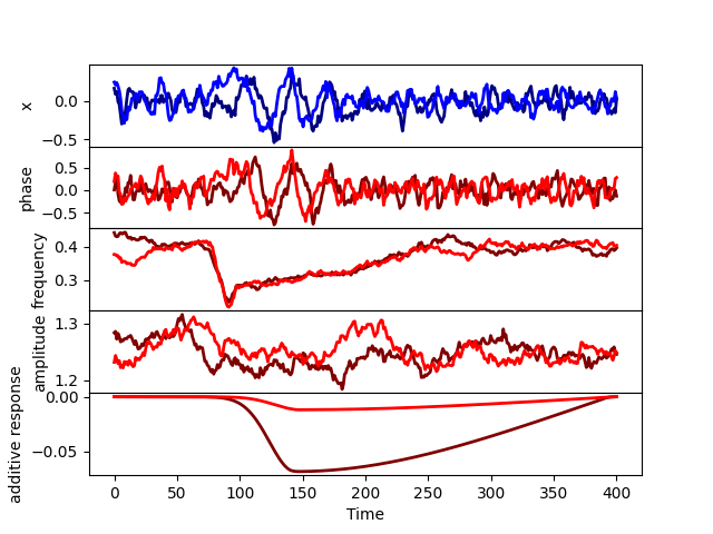
To plot the signals together with the components that made it up,
there is the method graphics.plot_signal(),
which can take as arguments
X: the dataPhase: the phase of the ongoing oscillationFreq: the frequency of the ongoing oscillationAmplitude: the amplitude of the ongoing oscillation (the square root of the power)Additive_response: the sum of the additive responsesStimulus: the array of stimulin: the index of the trial to plotj: the index of the channel to plot

graphics.plot_signal(X,Phase,Freq,Amplitude,Additive_response,None,n=0,j=0)
Any of the second to sixth argument can be omitted ot set to None, and it will be skipped. Note that phase, frequency and amplitude refer to the ongoing (possibly phase reset) signal, before any additive response or measurement noise is added. An example of this function can be seen above.
To plot an average evoked response for a given channel, we can use the method
graphics.plot_erp(), with arguments
Stimulus: the array of stimuli, which has to be categorical (see above)X: the dataPhase: the phase of the ongoing oscillationFreq: the frequency of the ongoing oscillationAmplitude: the amplitude of the ongoing oscillation (the square root of the power)Additive_response: the sum of the additive responsesj: the index of the channel to plot
graphics.plot_erp(Stimulus,X,Phase,Freq,Amplitude,Additive_response,j=0)
To plot the TGM or time-point-by-time-point decoding accuracies,
there is the method graphics.plot_accuracy(),
which takes the accuracy as given by decoder.decode() and
the colour limits (only used if a TGM is provided).
If we performed decoding for more than 2 classes,
then we should index the pair of conditions that we wish to plot
out of the (Q*(Q-1)/2) pairs:
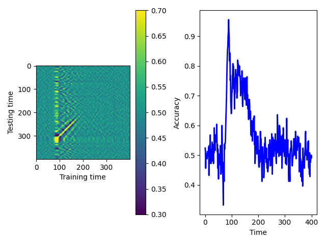
graphics.plot_accuracy(accuracy[:,:,1],(0.3,0.7))
We can also plot the decoding coefficients (the betas) using graphics.plot_betas(betas):
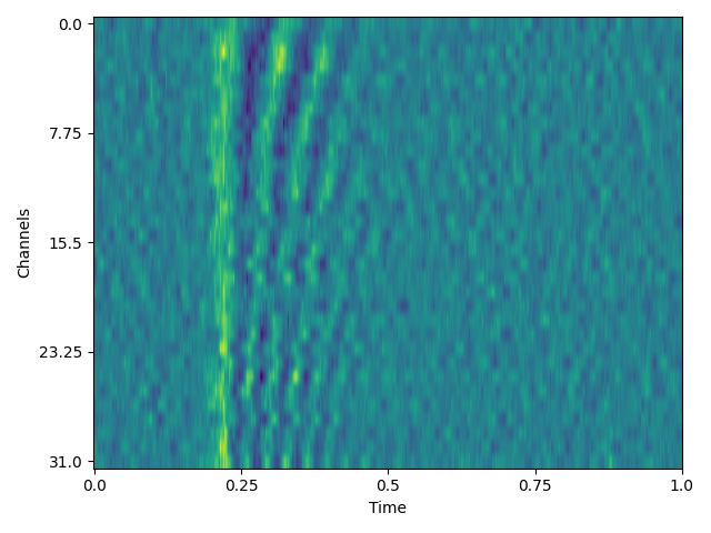
graphics.plot_betas(betas)
Finally, we can plot the activation functions to see how the parameters
affect their shape. For this we can use graphics.plot_activation_function()
with parameters
kernel_type: e.g.('Exponential','Log'),kernel_par: e.g.(25,(10,150,50),T: number of time points in the trialt: when the stimulus occurs?delayof the responsejitterin the delay.
For more information about kernel parameters and delays, as well as examples, see above.